Required Question:
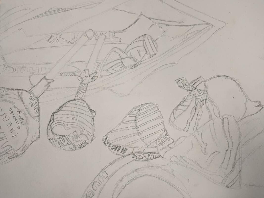
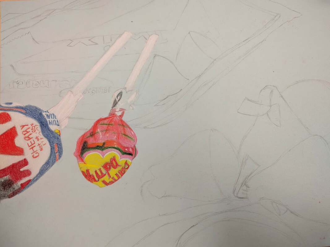
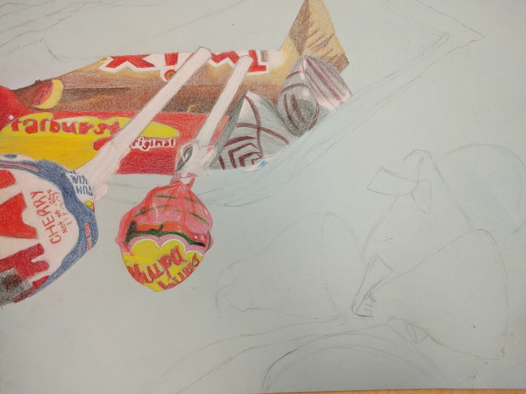
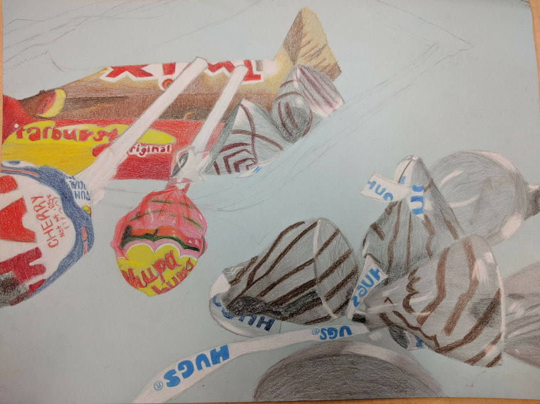
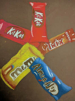
1. A project I felt was challenging yet successful was the opacity project. When I was first brainstorming ideas for this project, it was challenging to create a creative, vibrant reference photo. It took me a few days to come up with all the ideas I wanted to use, especially since I was traveling at the time. To come up with ideas, I looked to Pinterest for inspiration along with everyday ordinary items around my house. I ended up narrowing it down to two main ideas, a container with cookies and an assortment of candy in a Ziploc bag with some spilling out of it. I ended up choosing the second option. To develop this idea, I first did a practice drawing to figure out the proportions and positions of the candy along with the size of the Ziploc bag. Then, I decided what colors to use in the piece. I ended up using a wide range of colors, since there were a variety of candies pictured. When working on the final piece, I made sure to layer the Prismacolor pencil, to make it look smooth and clean. Despite the process being long, I think the assortment of candies came out really well in the piece. The most challenging part about this project in my opinion was shading the Ziploc bag. It is very important to learn how to shade things with different types of opacity. I feel as if I got a general grasp of the shading. If I could go back to one project, it would be this one. I would want to redo the shading of the bag because I feel as if I could have done a better job on it with the knowledge I have gained. Nevertheless, I am still extremely happy with myself in regards to this project. I believe I did a good job on it.
This is the final piece for this project.
Here is the initial brainstorm for the project.
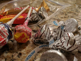
Here is the idea I ended up going with. |
Theses are the composition sketches for the reference photo. |
Below is the rough draft and the in-progress pictures for this piece. Click to view in more detail.
Additional Questions:
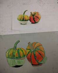
1. Two pieces that show my growth as an artist are the still life piece and the pastel candy piece. Even though the still life piece was our first main project, I'd never done something like that before. I learned to use different types of drawing pencils when shading the various items in the piece. I learned used various techniques such as stippling and other methods in the piece. I learned to look for values you wouldn't normally be able to see when just looking at the landscape. I applied the various values in the piece, making sure the highlights and the darks were where they needed to be. I don't think this piece was the most creative, since it was drawing from life. I still learned what makes a piece creative and out there. In terms of intuition, I chose to go a certain route when picking what orientation I wanted to do the piece in along with what parts I wanted to include in my piece. The subject matter was that I chose to go with a part of the landscape in portrait form. Switching over to the pastel candy piece, it was one we did later in the semester. I think I applied the materials well. I used a variety of the pastels along with the pastel colored pencils. I learned how to blend pastels together and how to make the piece itself look clean. The artistic vision for this piece was utilizing the colors I had to make it look as realistic as possible. I think I blended the colors together well. I feel as if my choice in colors was a creative outlet to go, since they were all extremely vibrant. I chose to draw the candies as they were, not altering any color present. I ended up drawing wrapped candies in portrait form, using pastels and pastel colored pencils to shade the piece.
|
The far left is the pastel piece. The closer one is the still life. |
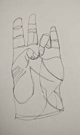
2. I think this portfolio is an accurate representation of my drawing as a whole. It shows my good art pieces and the ones that always could use a little work. I say this because no artist is ever perfect. All creators have their strengths and weaknesses. This portfolio reflects the things I am good at and the things I am not good at. I hope I can look back on this portfolio and see how much I have grown from this class. It was definitely a journey to get here and I am excited to see what will happen next. (Shown to the right is a modified contour drawing of my hand.)
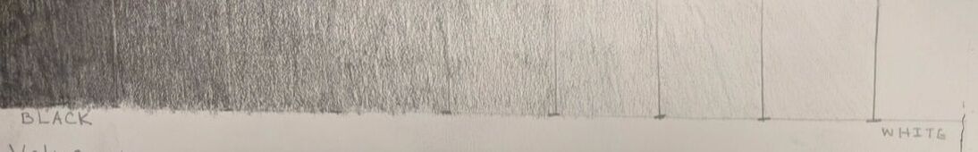
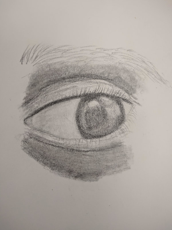
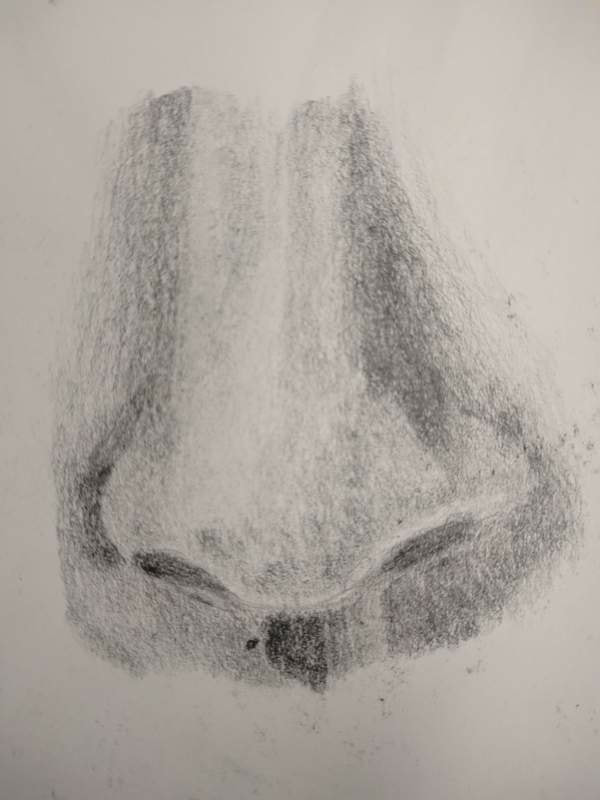
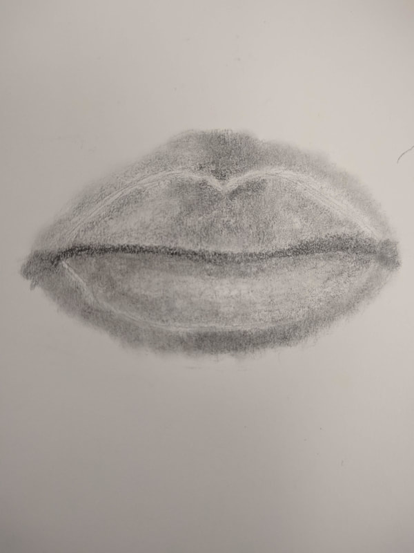
3. One mini lesson I thought was beneficial to my learning was the value charts we did in the beginning of the semester. This exercise was the foundation of this class. We had to learn how to shade values with more or less intensity, which I thought was extremely helpful for the project we were doing at the time and other projects throughout the semester. It was essentially a value chart from the darkest to the lightest values, drawn in our sketchbook. It was pretty self-explanatory, so I do not think additional instruction was required for this part. Nevertheless, I feel like this assignment was explained really well, because it gave me a good starting point in shading and other assignments. Another mini lesson I thought was beneficial to my learning was the individual facial features, done towards the end of the semester. I thought this was helpful because it gave us an opportunity to practice before our final portrait piece. I asked for some help throughout this process, but most of it was of my own doing. This comes in part from the value lesson in the beginning of the semester. I think this lesson was taught well, because I knew exactly what I had to do to make those facial features look realistic. (The value chart, followed by the facial features. Click to view the facial features in more detail.)
4. My favorite medium to work with was the Prismacolor pencils. I love this medium because it adds so much color and life to a piece if used the right way. Prismacolor pencils are so fun to work with in my opinion, because I love seeing a piece become vibrant and colorful. I was able to master the techniques associated with this piece by learning how to layer the colors on top of each other. I learned that it was important to apply these colored pencils a certain way, since they are of a different quality than other pencils. I also learned that I needed to be patient when using these materials. The shading and blending of a piece has to be slow and steady. The artist needs to make sure those strokes look smooth and clean.
