
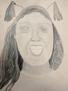
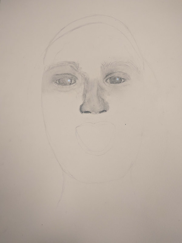
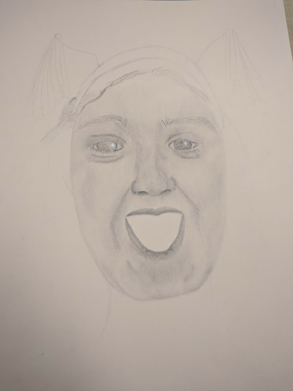
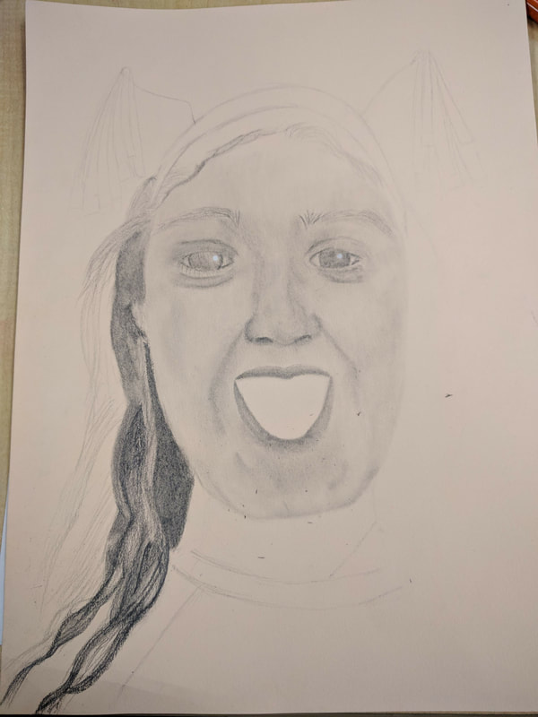
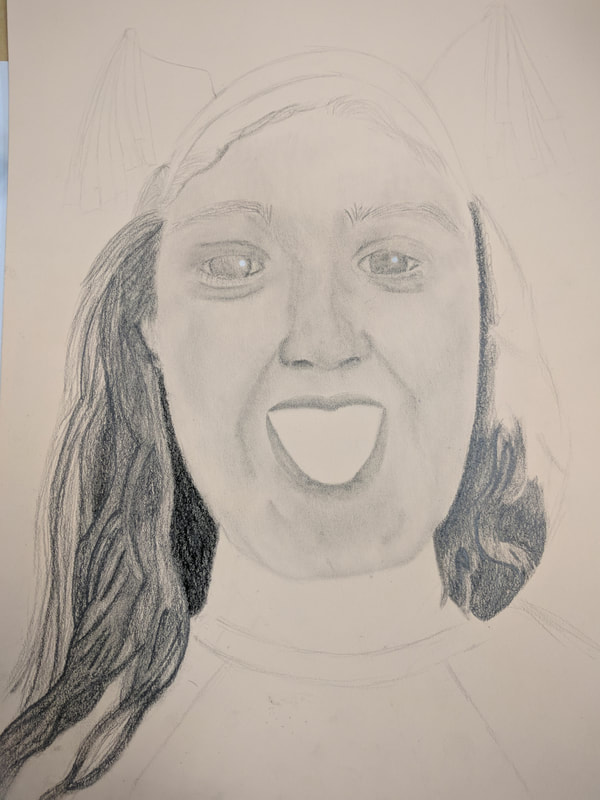
 This is the final piece for the portrait project. Questions Q: Explain the process you went through to develop your drawing. A: I first had to find three reference photos to decide what I wanted to do for the project. I picked my favorite, did a practice portrait and then got the drawing paper for the actual final piece. Q: Explain how you found the different values in the portrait. A: Since I shaded my piece in graphite pencil, I decided to make my reference photo black and white. That made it way easier to find the different values in the photo. Q: Did you achieve a full range of the different values within your portrait? How? A: I think I achieved a good range of the different values with my piece. I followed the photograph closely and made sure to layer and blend everything together. Q: Describe your craftsmanship. Is the artwork executed and crafted neatly? A: I feel as if the artwork was executed well. I made sure to use the blending tools and made sure I was layering the various types of graphite on top of each other. Q: How were you able to capture your look? A: I was able to capture my look by paying attention to where the light fell on my face. I payed attention to the shading so it looked realistic. Q: Explain how you made sure you had correct facial feature placement. A: I used the width of the eyes to measure where the other features would go. Q: Explain the importance of learning how to draw all the features individually. A: It is important to learn how to draw the features individually so you can learn how to shade them correctly. If I went into this blind, the piece itself wouldn't have looked as good. I'm glad I got to practice the facial features before-hand. Q: What part of this unit was the most beneficial and why? A: The most beneficial part of the unit was learning how to draw the individual facial features. I really did not know how to draw them before, it was really fun to learn! Q: List any obstacles you had to overcome and how you dealt with them. A: An obstacle I had to overcome was drawing and shading the hair. Since I have curly hair, I had to make sure I was shading the highlights and dark portions of my hair correctly. I made sure I took my time with drawing it and made sure it looked realistic. 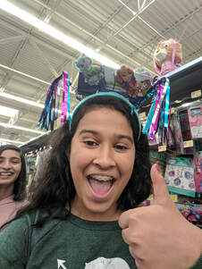 Here is the reference photo. Here are some in-progress photos. Click to view.
0 Comments
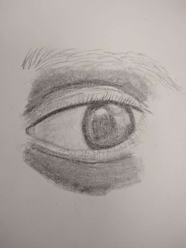
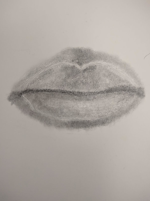
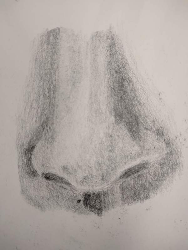
For this assignment, we were supposed to draw our own eye, lips and nose and use value to make them look realistic.
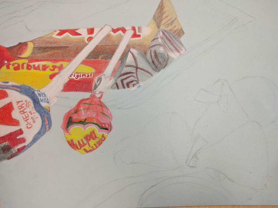
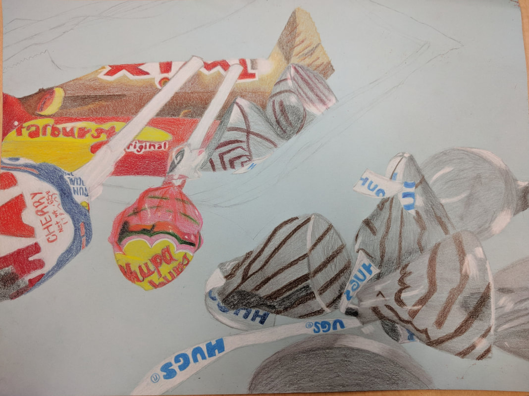
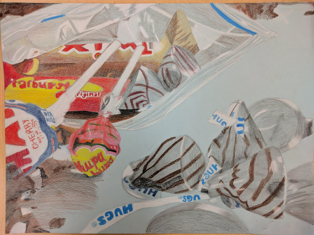
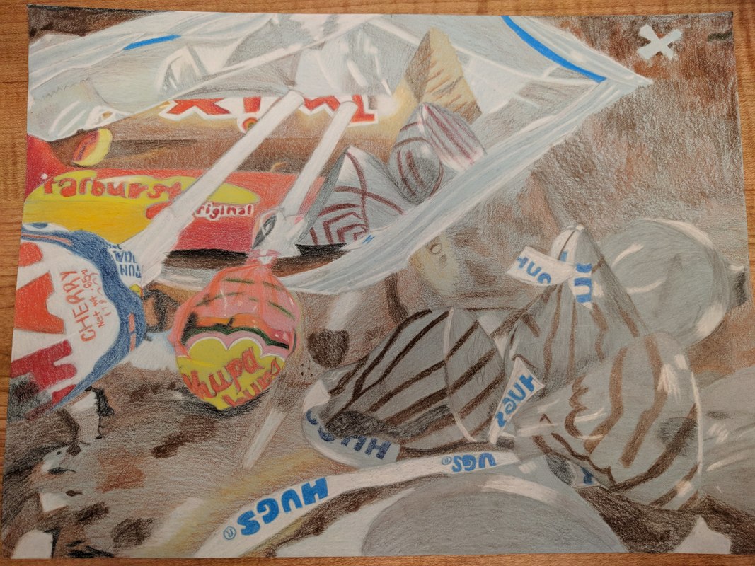
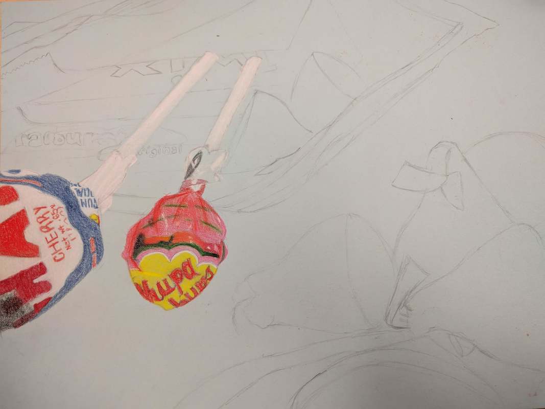
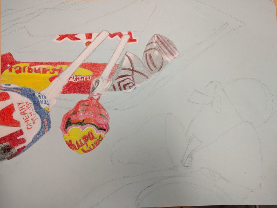
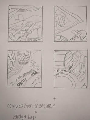
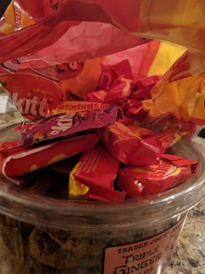
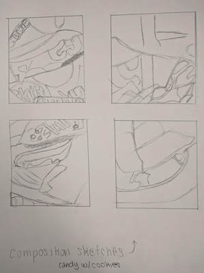
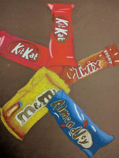
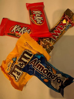
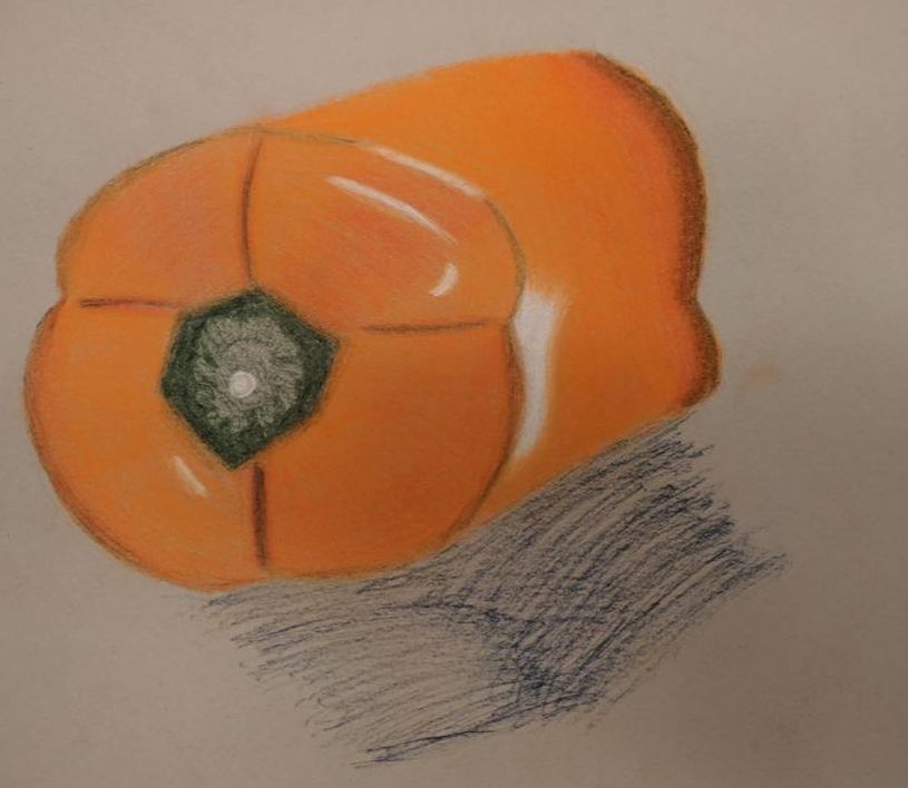
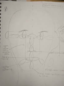 We were also supposed to draw the facial placement, using the eye as a rough measurement of where the facial features were supposed to go. 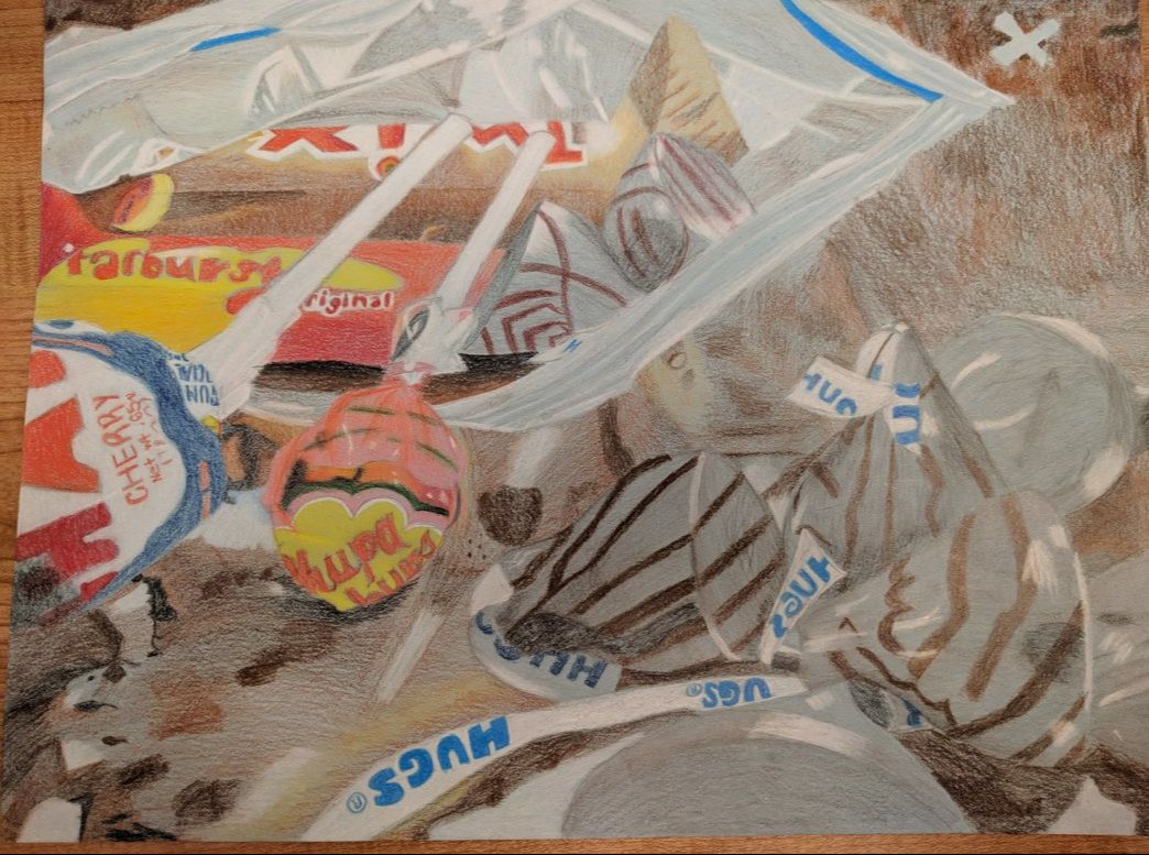 Here is the finished piece for this project. Questions: Q: Describe the craftsmanship of your drawing. A: I feel as if the craftsmanship of my drawing was well executed, especially with the candy in the plastic bag. I did a better job on the plastic bag than I had originally thought. I didn't do as well on the marble counter, because I didn't have enough time to make it detailed. That is what I would improve on. Q: Describe how your background choices help unify the artwork. A: I think the browns of the marble contrast very well with the multicolored candy. I wish I would have gotten more time to work on the marble, it doesn't look like the best it could be. Q: Describe your choice of colors/color harmonies and how you used them throughout the artwork. A: I think I chose all my colors well. All of the candy has some variation of color, which I like about the piece. All the candies contrast well from each other. Q: How did you create contrast in your drawing? A: I created contrast in my drawing by incorporating shadows and using the pressure of my hand on the pencils. Q: How did you use textures, highlights and shadows to enhance your artwork? A: The highlights and shadows are more apparent in this drawing than the texture. I feel as I took both of them and incorporated them well in my drawing. I would work a little more on the texture of the wrapped candies though. Q: Why did you choose a particular background color to mount your artwork? A: I chose blue because it would contrast well against all the other colors in my piece. Q: Discuss the importance of understanding the media and acquiring the skills necessary to create a successful project. A: It is important to understand the media being used because Prismacolor pencils are different from pastels. Prismacolors are a lot lighter when you first apply them. It is important to use layers when you are shading, and to always keep your pencils sharp. It is important to acquire the skills necessary because that is how a successful project is made. You need to know how to shade, put in highlights, use texture and a lot more to create a good piece. Q: Describe any difficulties you had creating your drawing. What could you do to improve your drawing? A: The most difficult part for me was getting the proportions right and shading the plastic bag. I think I could improve on the marble counter and adding texture to the wrapped candies. 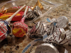 Here is the reference photo for this project. Here are the in-progress photos for this project. Click to view: Here are two in progress photos for the Opacity project. Click to view. We were supposed to brainstorm 15 to 20 ideas for this project.We were then supposed to pick two, take pictures and make composition sketches for them. 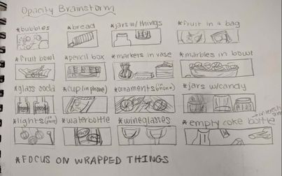
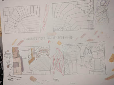
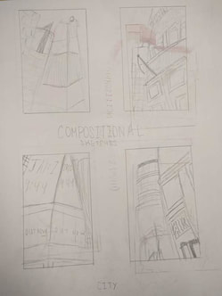
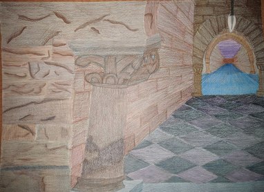 Here is my final piece for this project. Critique Questions Q: Describe how you created an interesting point of view. Was it successful? Why or why not? A: By utilizing one-point perspective, I was able to show the views of the wall and what was beyond that. I thought it was successful since you can clearly see the change in wall and the pillars in the distance. Q: Why is it important to understand perspective and how to draw it? A: It is important to understand perspective so that the drawing of it will be more real and not seem as flat. It is important to draw perspective to understand how things are positioned and how distance plays a very important role of the size and location of the drawings. Q: How were the colored pencil exercises important in the success of your piece? A: The colored pencil exercises were important because they helped me practice blending colors together, along with helping me with the pressure of the colors in certain areas. Q: Describe the craftsmanship of your colored pencil. What techniques were used? A: For the most part, I think I did a good job with blending the colors and making sure I was layering them. There are some parts of the piece that I could have done a better job with, but I think most of it was shaded well. I shaded in circles and made sure to shade lightly and use layers. Q: Were you able to achieve depth by showing a foreground, middle ground and background? A: I was able to achieve depth. As the focus goes farther back on the piece, the colors get darker and more intense, which shows the depth of the walls and the pillars. Q: Explain your experience with colored pencil and the project in general. What were the obstacles and advantages? A: Despite this project being a little tedious, I had fun shading the piece and blending different colors to achieve a new one. One advantage to using the colored pencil was the bursts of color achieved in the piece. One disadvantage to the colored pencil was that it took time to blend all the color and get the drawing fully shaded. Q: Looking back on the progression of this project, what skills, techniques or other information would you like to have been taught? Do you feel you were prepared for this project? A: I would have liked to been taught more about blending and mixing colors, since it took me a few tries to get the right color of the walls. Despite this, I think I was prepared enough for this project to make it look good. 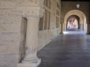 Here is the reference image.
To brainstorm ideas for the final project,we were supposed to draw twenty ideas with perspective. We were then supposed to pick two of the twenty ideas and draw composition sketches for them. 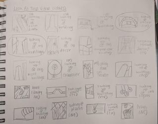 Here are the twenty ideas.
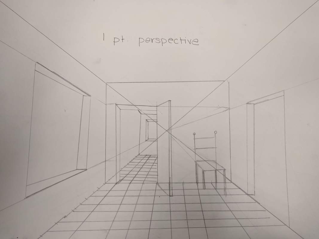
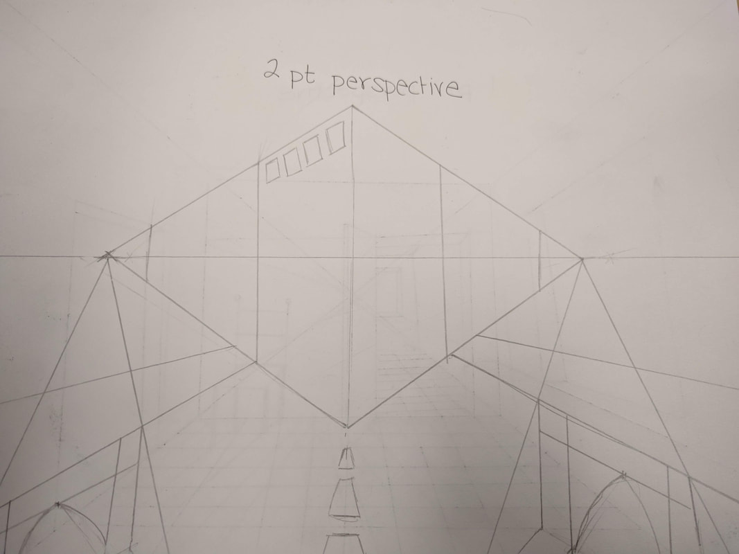
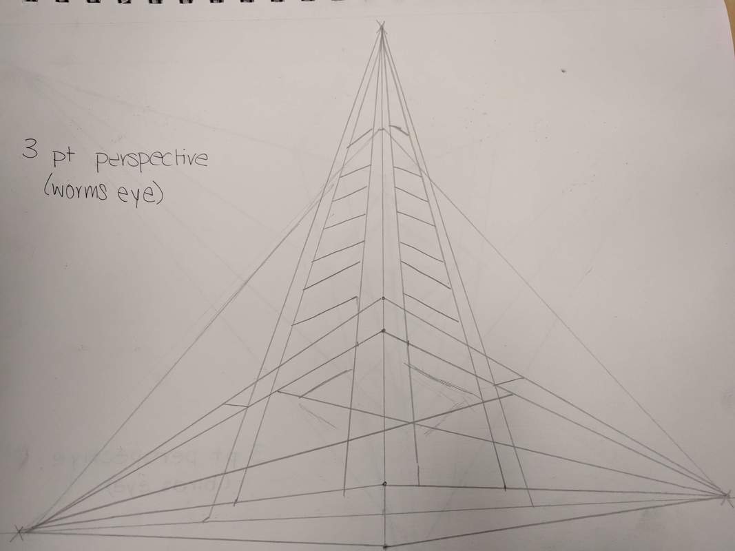
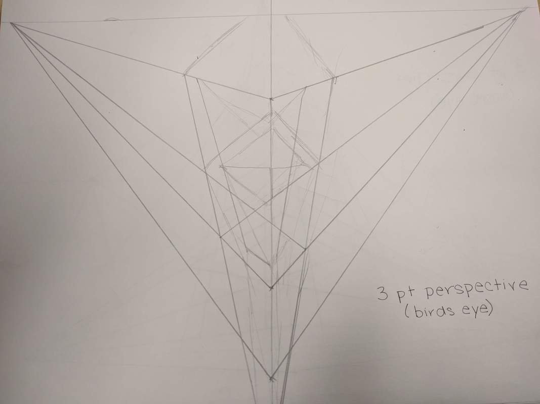
For this assignment, we were supposed to watch videos on perspective and follow along with them. Below are the drawings of one-point, two-point, three-point worms eye, and three-point birds eye perspectives. Click to view in more detail. |
AuthorHi :) Archives
January 2019
Categories |

 RSS Feed
